A logo used to be a fixed covenant between a brand and its audience — carved into stone, pressed onto business cards, and never to be questioned. Today, that covenant has a new clause: flexibility. Whether your brand lives on a 6-inch mobile screen or a 40-foot billboard, whether your customer is 22 or 62, your mark needs to morph intelligently without losing its core identity. This is the age of the adaptive logo — and understanding how to design one is no longer a luxury for enterprise brands. It’s a baseline expectation.
The shift didn’t happen overnight. Cultural acceleration, platform proliferation, and a generation of audiences who grew up watching brand identities evolve in real time have collectively raised the bar. Logos that once felt timeless now feel rigid. The question isn’t whether your brand identity should adapt — it’s how gracefully it can do so while preserving what makes it recognisable.
What Does It Mean for a Logo to “Move”?
When we say a logo moves with its audience, we mean two distinct things. First, literal motion — animation, morphing transitions, and kinetic behaviour that bring a mark to life in digital environments. Second, conceptual movement — the ability of a logo system to flex across contexts, tones, sub-brands, or seasonal moments without fracturing its identity. The best modern logos do both.
Think of logos not as single illustrations but as systems with grammar. A system has rules — about colour, proportion, form, and permitted variation. Within those rules, infinite variation is possible. Outside them, chaos ensues. The designer’s job is to define the grammar clearly enough that the logo can be handed to a dozen different executions and still feel like one coherent voice.
“A logo that can’t whisper is not a logo — it’s a shout with no range. Build systems, not symbols.”
Start with the Invariant Core
Before you design anything that moves, you must identify what cannot move. Every adaptive logo has an invariant core — the one element that, no matter what else changes, holds the identity together. For some brands it’s a distinctive silhouette. For others it’s a unique colour relationship or a proprietary typeface. Identifying this anchor is the single most important step in adaptive logo design.
A useful exercise: strip your logo down to its most reduced form — perhaps a single letter, a geometric shape, or a symbolic icon — and ask whether it still reads as your brand at a glance. If yes, you’ve found your invariant core. If no, you may be relying too heavily on composite elements that won’t survive reduction. This is often where brands discover they’ve been hiding behind complexity rather than building true recognition.
Designer’s Checklist: Building an Adaptive Logo
- Define the non-negotiable core element — the one form or mark that anchors all variants.
- Create a minimum viable version (favicon-scale, monochrome) before building the full system.
- Document permitted colour swaps and backgrounds to prevent off-brand usage.
- Design motion with purpose — each animation should express a brand behaviour, not just show off technique.
- Test your logo system at extreme sizes and across light and dark environments before sign-off.
- Build a responsive grid: define breakpoints at which the logo transitions between variants.
Designing for Motion: The Four Principles
1. Purposeful choreography. Every animated element should express something about the brand’s personality. A fintech brand might animate with crisp, precise snaps — reflecting accuracy and trust. A children’s education platform might use bouncy, elastic movements that feel playful and safe. Motion is not decoration; it’s tone of voice made visible.
2. Easing over linearity. Mechanical, linear animations feel lifeless and robotic. Natural movement follows ease-in and ease-out curves — objects accelerate into motion and decelerate as they settle. Even a simple logo reveal will feel dramatically more considered if you apply an ease curve rather than a straight-line transition. Study the way physical objects actually move and let that inform your timing.
3. Brevity is sophistication. The impulse to make logo animations elaborate is almost always the wrong instinct. A 1.5-second reveal that resolves cleanly is infinitely more effective than a 4-second theatrical sequence that keeps audiences waiting. In interface design especially — where attention is scarce and patience is shorter — a logo animation should function like a punctuation mark, not a full sentence.
4. Accessibility in motion. A significant portion of your audience may experience motion sensitivity or vestibular disorders that make animated content uncomfortable or even harmful. Responsible motion design always respects the prefers-reduced-motion media query and provides a static alternative. Adaptive design that ignores accessibility isn’t adaptive at all — it’s selective.
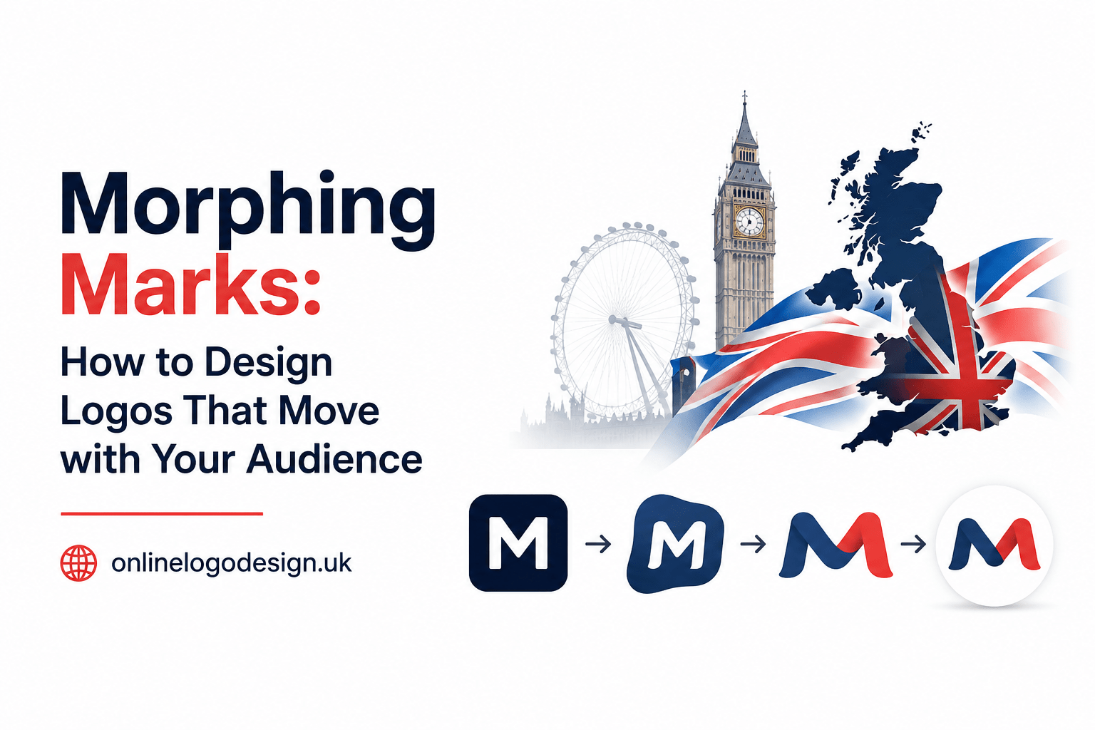
Contextual Variants: Designing the Logo Family
A fully realised adaptive logo system typically includes several defined variants: a primary version for standard use, a horizontal lockup, a stacked lockup, a standalone icon or monogram, and a reduced mark for favicons and app icons. Each variant must feel native to its context while sharing the same visual DNA. The temptation to treat variants as afterthoughts — scaled-down versions of the primary logo — is a common mistake that produces ugly, cramped results at small sizes.
Designers working with online logo design UK clients often note that the brief rarely specifies contextual variants upfront. Part of the designer’s expertise is educating clients on why a single-file logo is no longer sufficient. Presenting a logo system — with rationale for each variant — positions the work as strategic rather than merely aesthetic, and results in brand assets that actually perform in the real world.
Audience-Responsive Identity: Beyond the Static Brief
The most sophisticated logos of recent years have gone beyond static adaptability into genuinely audience-responsive territory. Generative logo systems — where the mark subtly shifts colour, texture, or form based on real-world data, time of day, or user behaviour — represent the frontier of what brand identity can mean in a connected world. While this level of complexity isn’t appropriate for every brand, the underlying principle is worth applying at any budget: your audience’s context should inform how your brand presents itself.
A local community brand might simply rotate between light and dark versions depending on season or event. A global platform might serve radically different visual treatments to different regional audiences while maintaining core recognition. Neither approach requires algorithmic complexity — just deliberate thinking about who sees the logo, when, and under what emotional circumstances. Empathy, not technology, is the engine of truly adaptive design.
“Great adaptive logos don’t just scale to different screen sizes. They scale to different human contexts — different moods, moments, and meanings.”
Testing Your Logo’s Adaptability
Before any logo system is signed off, it should pass what experienced brand designers call the stress test battery: extreme reduction (does it work at 16×16px?), extreme enlargement (does it hold quality at billboard scale?), monochrome rendering (does the form read without colour?), reversal (does it work on a dark background?), and animation (does it move with grace and purpose?). A logo that fails any of these tests has not been designed — it has been sketched.
Motion testing deserves its own mention. Render your animated logo at the lowest frame rate your platform supports. Test it on a device with a throttled CPU. Watch it on an ageing phone screen under bright sunlight. The environments in which your logo will actually be seen are rarely the pristine conditions of a design studio monitor, and the gap between those two realities is where adaptive logos succeed or fail.
The Future Is Fluid — Prepare for It
Brand identity is entering an era of radical fluidity. AI-generated content, spatial computing interfaces, and ever-multiplying screen formats will continue to push the boundaries of what a logo is expected to do. The designers and brands that thrive in this environment will be those who stopped thinking about logos as fixed assets and started thinking about them as living, breathing design systems — ones capable of moving with the same intelligence and grace as the audiences they serve.
Designing an adaptive logo is not about abandoning consistency — it’s about achieving a higher form of it. When a brand can flex across a hundred different contexts and still feel unmistakably itself, that’s not a compromise of identity. That’s the fullest expression of it. Start with your invariant core. Build the system with care. Design every motion with intention. And let your mark grow alongside the people it was always meant to speak to.